Visualizing Data
In today’s world, we have more information than we need. Large amounts of data are constantly being streamed from multiple sources. As a consequence, most organizations are outfitted with powerful computing processors and smart software that collect this BIG DATA. This leaves us with a most difficult challenge — how can we make sense of it all in a way that is most useful? This blog explores how we can take data streams and interpret them in a way that is easy to understand and adds value and help your organization visualizing data.
People are not very good at taking in raw data. We are not robotic computers like Commander Data in the Hit TV series; Star Trek, the Next Generation. He was capable of processing reams of textual raw data at any one given time.
On the contrary, people are extremely good at tasks such as edge detection, shape recognition, and pattern matching, while giving it meaning and make important decisions. “ Make-it-so number-one!” said Jean-Luc Pecard , Captain of the Starship Enterprise, in a very British voice.

Seriously, with the way the human brain processes information, it’s a lot faster for people to understand data when displayed in charts and graphs than it is in spreadsheets or pages and pages of reports. Besides, Commander Data was a real stiff (pardon the pun).
Getting straight to the point, this is what we now call DATA VISUALIZATION.
What is Data Visualization?
In simple terms, Data Visualization is the presentation of data in a pictorial or graphical format.
It encompasses the creation and study of the visual representation of data, meaning “information that has been abstracted in some schematic form, including attributes or variables for the units of information“. A primary goal of Data Visualization is to communicate information clearly and efficiently to users via statistical graphics, plots, information graphics, tables, and charts selected. In short, shapes and colors tell us better stories and help visualizing data.
So what’s is the big deal about BIG DATA?
Most organization today struggle with connecting the dots from the all these data streams that come from multiple applications such as: CRM, Spreadsheets, SharePoint and accounting systems.
Trying to make sense of it all often leads to DATA OVERLOAD.
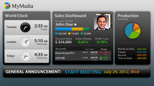
MyMedia’s Toronto and New York graphic and data visualize programmers will turn your information display board into a tangible asset for your organization.
Our dashboards merges all sources of data and makes it accessible on any screen, anywhere. The solution displays real-time insights so that your team can take actionable steps with greater efficiency.
One other feature our dashboard can offer is putting in additional algorithms that are relevant to your department, which can help run your business more efficiently.
For instance, if you’re running a Call Center and a call runs past your ten-minute threshold, our programmers can build a mechanism to:
- change the display with the appearance of an icon, or
- make your line item on the dashboard start flashing, reminding the agent on-call to start wrapping up, or
- alert the Call Center Manager to come over and assist with the call.
The amount of algorithms are endless – the only limit is your own imagination.
Our data visualization dashboards are dynamic, easy to read and provides your organization with relevant information at the right time and place.
Do you have a challenge managing your data? Do you want to see your system help you by visualizing data by displaying it in a coherent manner that is tangible and easy to comprehend?
Give us a call — we’d be happy to assist you.