Are you wondering, “How can data show emotions?”
That’s what I thought too when we were approached by a corporate client that manages an IT department for a number of outbound sales teams.
The organization had a variety of challenges. One of them was trying to monitor the progress of each sales agent in real-time. Trying to see their daily and weekly performance at a glance was also missing from their tool set. Basically, they were looking to integrate the data that was coming from their Avaya phone system with Altitude uCI, an application that aggregates the telephone, calls and delivers metrics.
The Altitude application does deliver Visual Data, but it’s not customized to the individual call centers requirements. This was both an opportunity and a challenge for us to delve into.
Displaying data for the sake of displaying data can sometimes be meaningless if it’s not tied into metrics that your organization has established as good or bad. For instance, for some call centers, making 35 calls per day is not good and for other organizations, it’s ideal. Using a happy face, five stars beside the agent’s name, or conversely, three rotten tomatoes beside a specific project (borrowing ideas from Apple TV) makes those numbers more meaningful, and adds a little bit of fun.
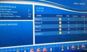
We created a layout that has three separate zones and a message marquee for supervisors to type a quick message on the back end of the solution. This is a great way to communicate with all the agents while they’re busy, on call. Real-time status icon are used beside each of the agent’s name, such as ON/OFF CALL, BREAK, MEETING, and LUNCH BREAK and includes the duration of time for each icon. This also gives us the opportunity to build some BI (Business Intelligence). For instance, none of their existing phone systems were capturing the time each agent was off the phone. Our programmers were able to build the logic on top of the existing application, which aggregated how much total time the agent was off-line.
The main zone is what I find most interesting and what I want to focus on. The function of this zone is to monitor the sales agents’ progress throughout the day and display their weekly outcomes. It also monitors how many actual sales are made. Once again, this information is displayed in real-time. What I think is most brilliant is the idea of adding emoticons as KPI’s (key performance indicators) to show their progress throughout the day. For instance, if they are underperforming with outbound calls, it will display a sad face. If the performance is really good, a happy face appears.
I have to applaud our client’s idea of using symbols like emoticons to communicate with the sales agents about their progress. I also believe it makes it easier for managers, supervisors and agents to see, at a glance, if they are on track or not. During our brainstorming meeting, I suggested they wave a little checkered flag to indicate that they crossed the finish line when they reached their quota. The managers did not like that idea. Managers do not want sales people to think that there is a finish line! (I can appreciate that ☺) However, it’s important to note that when you’re using symbols to communicate with a data visualization dashboard, the possibilities are endless. All we need is access to the API and to understand the clients numeric values, thresholds and symbol legend (what each symbol equates to). This allows us to then build a dynamic and compelling data visualization dashboard, like the one we created for this client.
Here is a link to a video that gives you greater detail about the project:
Adding Emotion to your Sales Dashboard
What do you think – do you like the idea of using emoticons to add meaning to data? Can you think of other ways to make a data visualization dashboard more compelling and dynamic?
Please share your ideas with us in the comments below. I look forward to reading them, and potentially, collaborating with other data practitioners one day, such as data scientists and creative data designers.
Thanks for dropping by.